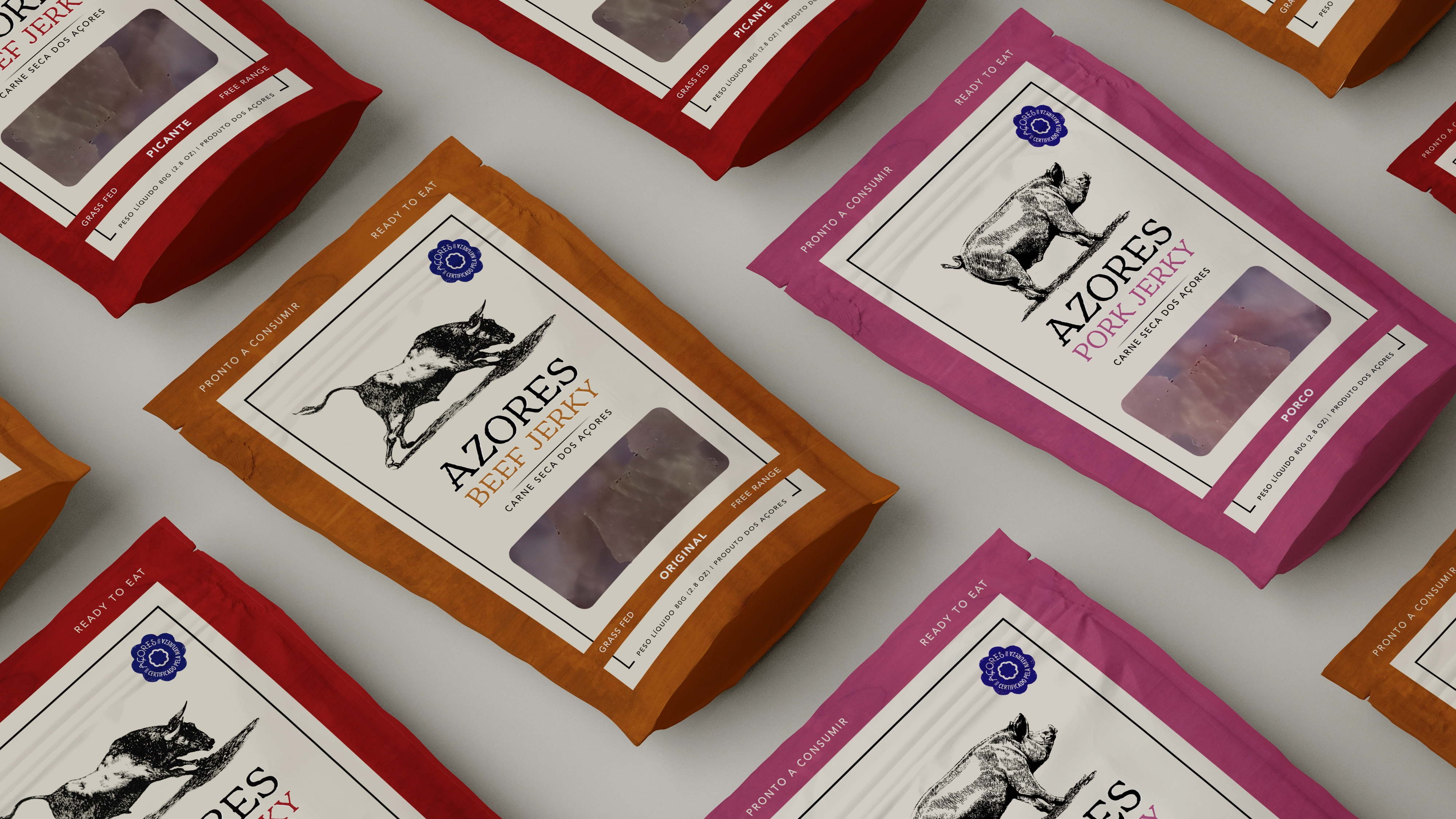
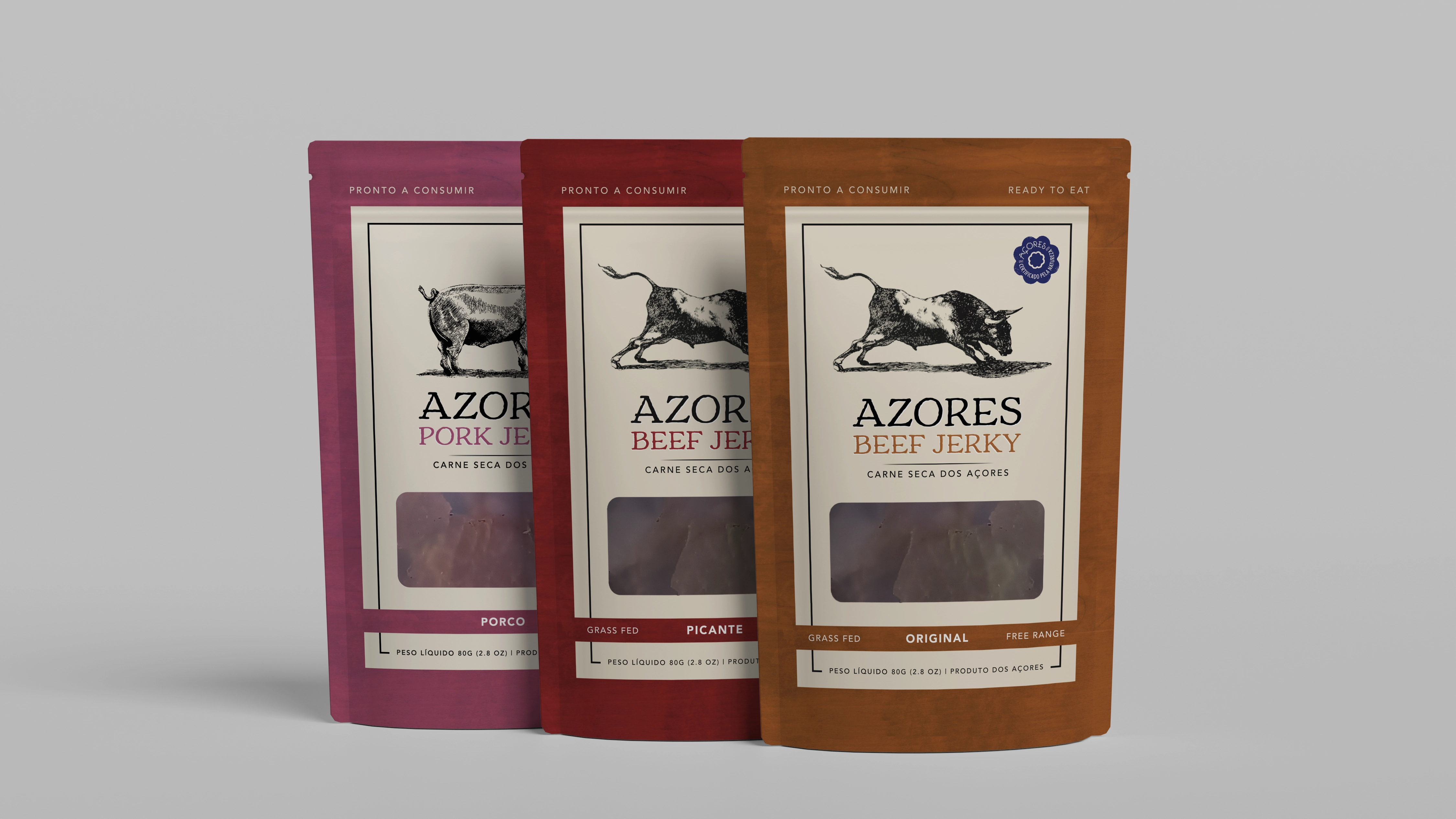
The project's challenge centered on creating a packaging design that reflected the craft quality and unique origin of Azores Jerky, while at the same time appealing to a global audience. To achieve this, we used a vibrant and distinctive color pattern, with each color chosen to represent a different variety of jerky, making it easier for consumers to identify and reinforcing the brand's visual identity. The design also incorporates visual elements that tell the story of the product's origin and refer to nature and the animals' freedom in the Azores. The packaging was designed to be as visually attractive as it is informative, highlighting jerky's attributes as a healthy and practical snack.